
#Miniaml-Mistakes 원격 테마
원격 테마의 장점은 Minimal-Mistakes 테마가 업데이트 될때마다 쉽게 업그레이드 할 수 있으며 폴더 구조가 단순합니다.
하지만 단점도 존재 하는데 구글에서 Minimal-Mistakes 테마의 Custome 방법을 검색하다 보면 대부분 _sass/minimal-mistakes폴더의 css파일을 수정하게 되는데, 이 부분을 수정할 수 없기 때문에 다른 방법을 찾아야 합니다.
본 글은 아래 링크에 있는 원격 테마에 대해 읽어보고 직접 실행해본 후기로, _sass/minimal-mistakes폴더의 css파일를 수정하지 않고 다른 방법으로 테마를 커스텀하는 방법에 대해서도 설명하고 있습니다.
📌https://mmistakes.github.io/minimal-mistakes/docs/quick-start-guide/
# gemfile 만들기
원격 테마를 적용하기 위해 새로운 폴더를 생성합니다. 그리고 아래와 같이 gemfile를 생성합니다.
source "https://rubygems.org"
gem "github-pages", group: :jekyll_plugins
gem "jekyll-include-cache", group: :jekyll_plugins
gem "webrick", "~> 1.8"
📢 gemfile 뒤에 txt 같은 확장자가 없음을 확인하세요.
# _config.yml 만들기
다음으로 _config.yml파일을 만들어야 합니다. Minimal-Mistakes Git 저장소에 있는 _config.yml파일의 내용을 복사합니다.
_config.yml 파일 중에 아래 내용을 참고하여 값을 수정 합니다.
# theme                  : "minimal-mistakes-jekyll"  # theme 속성은 주석처리 합니다.
remote_theme           : "mmistakes/minimal-mistakes" # remote_theme로 활성화 합니다.

# Site Settings
repository               : "mmistakes/minimal-mistakes" # 자신의 repository 주소를 입력 합니다.
# 원격 테마 테스트
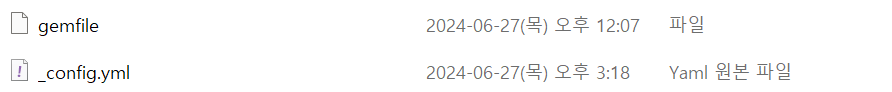
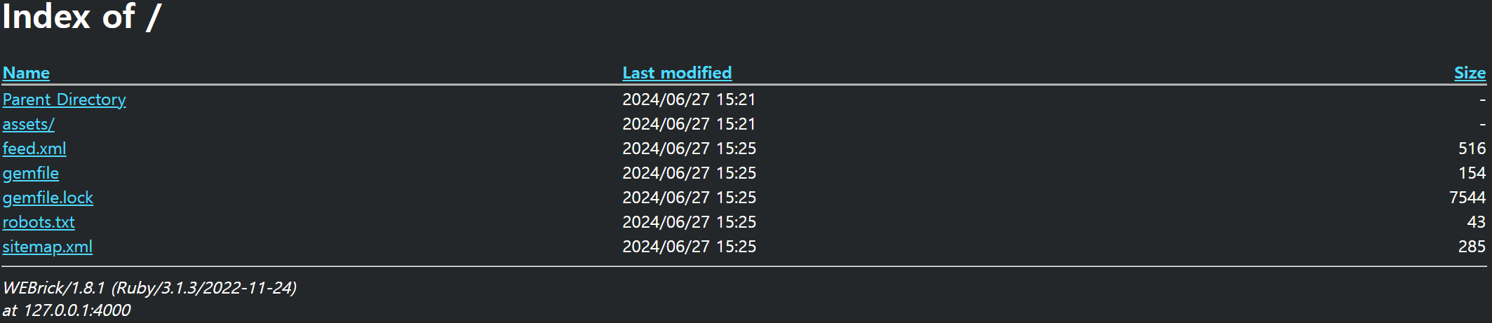
현재까지 폴더 내의 파일 리스트 입니다.
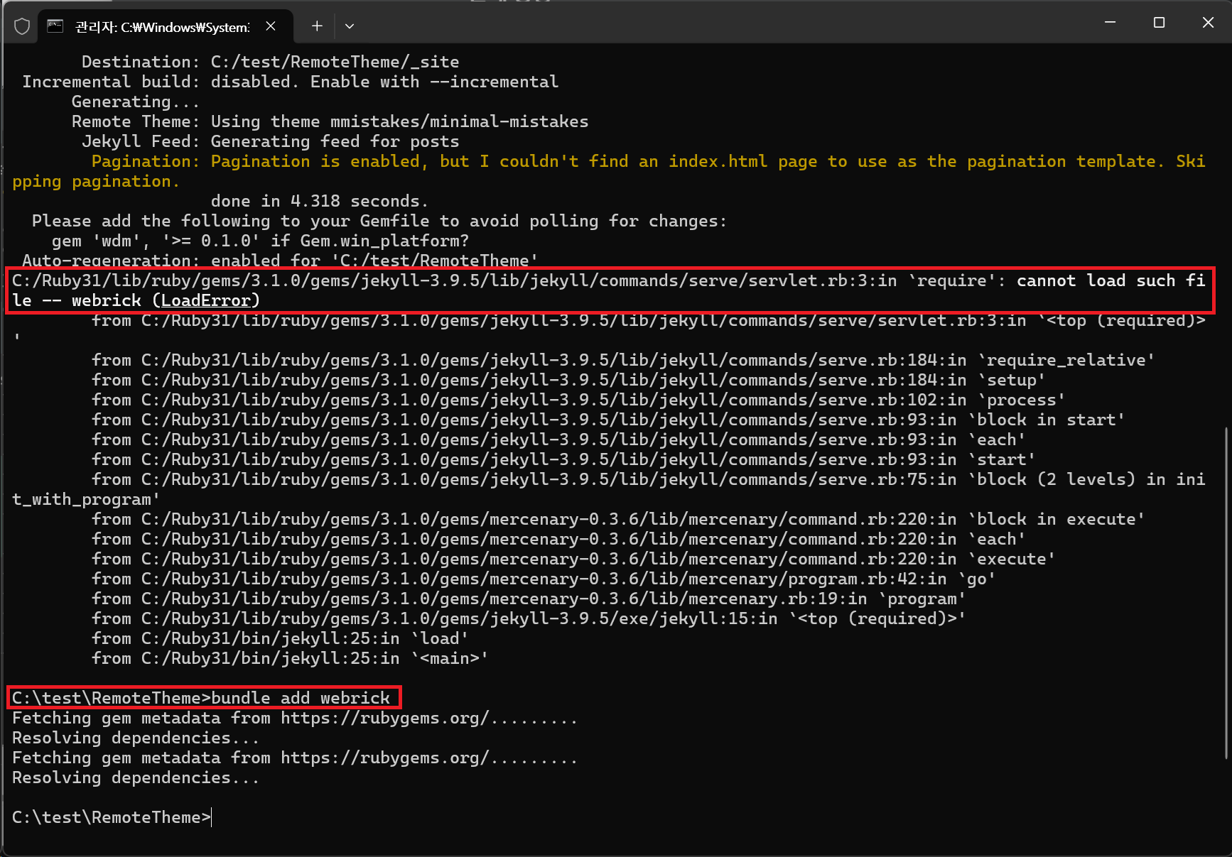
🔽 아래 명령어를 실행행합니다.
bundle exec jekyll serve
📢 오류가 발생한다면 Rudy가 설치되어 있는지 확인하세요.
webrick과 관련된 에러가 발생한다면 아래의 명령어를 실행 후 다시 실행합니다.
bundle add webrick
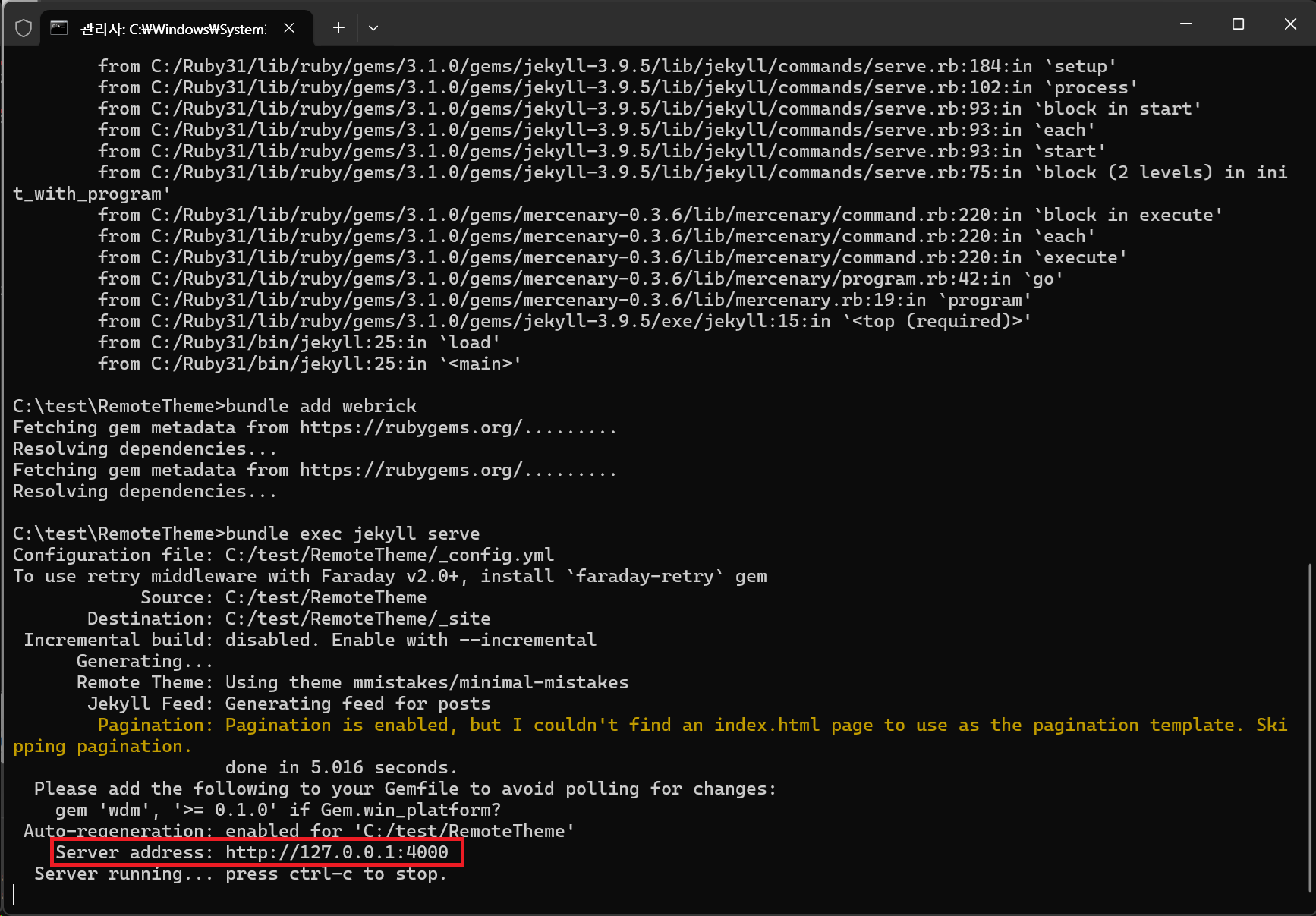
아래와 같이 실행되면 정상적으로 실행된 것입니다.
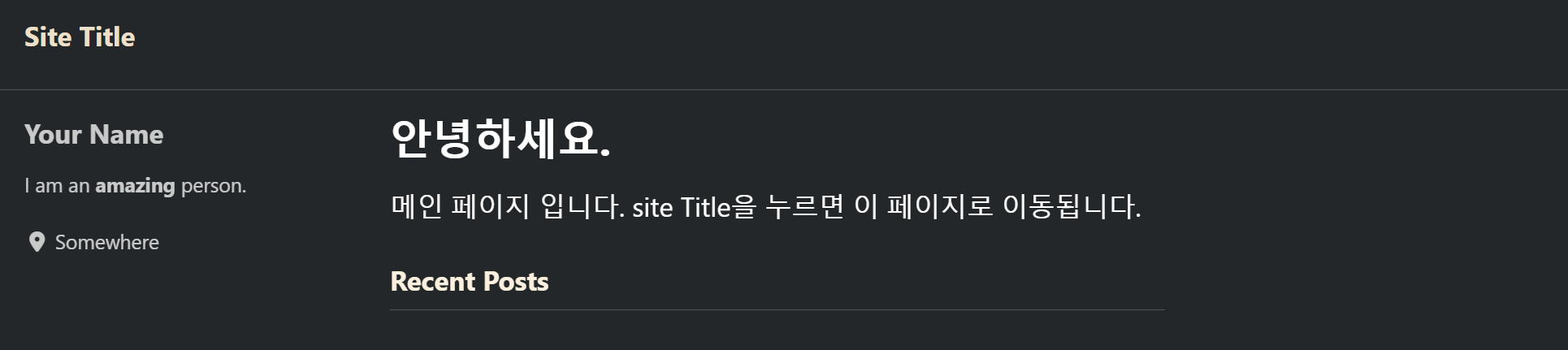
브라우저에서 확인해보겠습니다. 뭔가 표시되긴 하는데 이상합니다. 원인은 해당 웹 주소로 접근했을 때 보여줄 index.html파일이 없기 때문입니다.
index.md파일을 만들고 아래와 같이 입력합니다. 저장 후 다시 웹 브라우저에서 확인해봅니다.
---
title: "안녕하세요."
author_profile: true
---
메인 페이지 입니다. site Title을 누르면 이 페이지로 이동됩니다.
이제 정상적으로 웹 사이트가 표시되는 것을 볼 수 있습니다.
# 원격 테마 커스텀
시작 부분에서 원격 테마의 경우 _sass/minimal-mistakes폴더의 css파일을 수정할 수 없기 때문에 다른 방법으로 이 테마의 css를 수정해야 된다고 언급했었습니다. 원격 테마의 css 수정을 위해서 /assets /css에 main.scss 파일을 생성하고 아래와 같이 입력합니다.
이제부터 커스텀과 관련된 css내용들은 main.scss에 추가하면 됩니다.
---
# Only the main Sass file needs front matter (the dashes are enough)
---

@charset "utf-8";

@import "minimal-mistakes/skins/dark"; // skin
@import "minimal-mistakes"; // main partials
아래는 오원석님의 깃허브 블로그에서 원격 테마의 수정한 예시 입니다.
---
# Only the main Sass file needs front matter (the dashes are enough)
---

@charset "utf-8";

//
// 리모트 테마 또는 Gem 테마를 사용하는 경우
// 부분적으로 _sass 내의 파일을 수정할 수가 없다고 함.
// 때문에 /assets/css/main.scss 파일에서 재정의를 통해 수정을 하도록 함.
//

//
// Breakpoints 기준값 재정의 - 아래 import 이전에 정의해야 함.
//
// 기본 값이 데스크탑에서 large에서 x-large 이상 구간인 경우 폰트가 커지지만
// 양쪽 네비게이션 영역과 TOC 영역이 같이 넓어 지면서 상대적으로 표현할 수 있는
// 글 영역이 작아져서 효율적이지 못함을 느꼈습니다.
//
// 이에 이 영역을 포함한 전체 영역에 대한 조정을 실시했으며,
// 제가 가지고 있는 samsung z fold 3에서 외부 액정, 내부 액정, 내부 액정 회전시,
// 데스크탑에서 작을 때 부터 큰 사이즈 까지 모두 최적이라 생각되는 넓이에 맞춘
// 개인적인 최적화된 값 입니다.
//
// 원본위치: [remote-theme]/_sass/minimal-mistakes/_variables.scss
//
$small: 576px;            // default 600px
$medium: 720px;           // default 768px
$medium-wide: $medium;    // default 900px
$large: 992px;            // default 1024px
$x-large: 1340px;         // default 1280px
$max-width: 1600px;       // default $x-large

@import "minimal-mistakes/skins/dark"; // skin
@import "minimal-mistakes"; // main partials

//
// font 크기 재정의 - import 이후 정의해야 함.
//
// 위의 breakpoint와 함께 수정되었으며, large에서 글씨를 한 단계 올리지 않은 이유는
// nav, toc의 넓이가 변경되기 때문에 실제 컨텐츠 공간이 적어지는 부분을 고려했기 때문입니다.
// 데스크탑에서 x-large 이상일 경우 폰트를 올려 더 크게 표시되도록 하며 이는 기존 값보다
// 더 넓은 값을 사용하도록 합니다.
//
// 원본위치: [remote-theme]/_sass/minimal-mistakes/_reset.scss
//
html {
  font-size: 16px;                    // Default 16px;

  @include breakpoint($medium) {
    font-size: 18px;                  // Default 18px;
  }

  @include breakpoint($large) {
    font-size: 18px;                  // Default 20px;
  }

  @include breakpoint($x-large) {
    font-size: 20px;                  // Default 22px;
  }

}


//
// link underline 제거
//
// 기본 링크에 underline이 가독성을 떨어트려 제거하였습니다.
//
// 원본위치: [remote-theme]/_sass/minimal-mistakes/_basee.scss
//
a {
  text-decoration: none;                // 추가된 코드입니다.

  &:focus {
    @extend %tab-focus;
  }

  &:visited {
    color: $link-color-visited;
  }

  &:hover {
    color: $link-color-hover;
    outline: 0;
  }
}


//
// Grid Item 숫자를 4에서 3으로 조정
//
// collection layout등에서 사용하는 entries_layout: grid인 경우
// 표시되는 grid item의 개수가 4개로 설정되어 있는데 너무 작게 표시되는 것 같아
// 이를 3개로 표시되도록 수정하였습니다.
//
// 원본위치: [remote-theme]/_sass/minimal-mistakes/_archive.scss
//
.grid__item {
  margin-bottom: 2em;

  @include breakpoint($small) {
    float: left;
    width: span(5 of 10);

    &:nth-child(2n + 1) {
      clear: both;
      margin-left: 0;
    }

    &:nth-child(2n + 2) {
      clear: none;
      margin-left: gutter(of 10);
    }
  }

  @include breakpoint($medium) {
    margin-left: 0; /* override margin*/
    margin-right: 0; /* override margin*/
    width: span(4 of 12);

    &:nth-child(2n + 1) {
      clear: none;
    }

    &:nth-child(3n + 1) {
      clear: both;
      margin-left: 0;
    }

    &:nth-child(3n + 2) {
      clear: none;
      margin-left: gutter(1 of 12);
    }

    &:nth-child(3n + 3) {
      clear: none;
      margin-left: gutter(1 of 12);
    }

  }

  //
  // page hero에서 호출하는 page meta 출력시 사용되는 글꼴의 크기를 키웠습니다.
  // 제가 추가로 작성한 _include/excerpt_hero.html 에서 표시되는 readtime등의
  // meta 데이터 출력시 사용되는 값입니다.
  //
  // 이 값은 .grid__item 내에서 사용되는 값입니다.
  // 범용으로 선언 된 .page__meta와 별개 입니다.
  //
  // 원본위치: [remote-theme]/_sass/minimal-mistakes/_archive.scss
  //

  .page__meta {
    margin: 0 0 4px;
    font-size: 1em;         // default 0.6em
  }

  .page__meta-sep {
    display: block;

    &::before {
      display: none;
    }
  }

  .archive__item-title {
    margin-top: 0.5em;
    font-size: $type-size-5;
  }

  .archive__item-excerpt {
    display: none;

    @include breakpoint($medium) {
      display: block;
      font-size: $type-size-5;
    }
  }

  .archive__item-teaser {
    @include breakpoint($small) {
      max-height: 200px;
    }

    @include breakpoint($medium) {
      max-height: 200px;
    }
  }
}


//
// .notice 글자 크기 조정
//
// 원본위치: [remote-theme]/_sass/minimal-mistakes/_notices.scss
//
@mixin notice($notice-color) {
  margin: 2em 0 !important;  /* override*/
  padding: 1em;
  color: $text-color;
  font-family: $global-font-family;
  font-size: $type-size-5 !important;     // default $type-size-6
  text-indent: initial; /* override*/
  background-color: mix($background-color, $notice-color, $notice-background-mix);
  border-radius: $border-radius;
  box-shadow: 0 1px 1px rgba($notice-color, 0.25);

  h4 {
    margin-top: 0 !important; /* override*/
    margin-bottom: 0.75em;
    line-height: inherit;
  }

  @at-root .page__content #{&} h4 {
    /* using at-root to override .page-content h4 font size*/
    margin-bottom: 0;
    font-size: 1em;
  }

  p {
    &:last-child {
      margin-bottom: 0 !important; /* override*/
    }
  }

  h4 + p {
    /* remove space above paragraphs that appear directly after notice headline*/
    margin-top: 0;
    padding-top: 0;
  }

  a {
    color: mix(#000, $notice-color, 10%);

    &:hover {
      color: mix(#000, $notice-color, 50%);
    }
  }

  code {
    background-color: mix($background-color, $notice-color, $code-notice-background-mix)
  }

	pre code {
		background-color: inherit;
	}

  ul {
    &:last-child {
      margin-bottom: 0; /* override*/
    }
  }
}

/* Default notice */

.notice {
  @include notice($light-gray);
}

/* Primary notice */

.notice--primary {
  @include notice($primary-color);
}

/* Info notice */

.notice--info {
  @include notice($info-color);
}

/* Warning notice */

.notice--warning {
  @include notice($warning-color);
}

/* Success notice */

.notice--success {
  @include notice($success-color);
}

/* Danger notice */

.notice--danger {
  @include notice($danger-color);
}

//
// archive list page meta 글자 크기 조정
//
// 원본위치: [remote-theme]/_sass/minimal-mistakes/_archvie.scss
//

/*
   List view
   ========================================================================== */

.list__item {
  .page__meta {
    margin: 0 0 4px;
    font-size: 0.8em;         // default 0.6em
  }
}

.archive__item-excerpt {
  margin-top: 0;
  font-size: $type-size-5;

  & + p {
    text-indent: 0;
  }

  a {
    position: relative;
  }
}

//
// categories, tags, years 에서 사용하는 taxonomy index 글자 크기 조정
//
// 원본위치: [remote-theme]/_sass/minimal-mistakes/_page.scss
//
.taxonomy__index {
  display: grid;
  grid-column-gap: 2em;
  grid-template-columns: repeat(2, 1fr);
  margin: 1.414em 0;
  padding: 0;
  font-size: 1em;                         // default 0.75em
  list-style: none;

  @include breakpoint($large) {
    grid-template-columns: repeat(3, 1fr);
  }

  a {
    display: -webkit-box;
    display: -ms-flexbox;
    display: flex;
    padding: 0.25em 0;
    -webkit-box-pack: justify;
    -ms-flex-pack: justify;
    justify-content: space-between;
    color: inherit;
    text-decoration: none;
    border-bottom: 1px solid $border-color;
  }
}

//
// page meta 글자 크기 조정
//
// 원본위치: [remote-theme]/_sass/minimal-mistakes/_page.scss
//
.page__meta {
  margin-top: 2em;
  color: $muted-text-color;
  font-family: $sans-serif;
  font-size: $type-size-5;        // default $type-size-6

  p {
    margin: 0;
  }

  a {
    color: inherit;
  }
}

//
// table 글자 크기 조정
//
// 원본위치: [remote-theme]/_sass/minimal-mistakes/_tables.scss
//
table {
  display: block;
  margin-bottom: 1em;
  width: 100%;
  font-family: $global-font-family;
  font-size: $type-size-5;            // default $type-size-6
  border-collapse: collapse;
  overflow-x: auto;

  & + table {
    margin-top: 1em;
  }
}
Leave a comment